
Keeping customers engaged is going to make the difference between a brand thriving and surviving in the current economic environment. As we brace for one of Australia’s top trading days of the year on Easter Saturday, User Experience (UX) optimisation will help brands create more seamless and rewarding digital journeys for new and returning users. Providing customers with a blended physical and digital experience has become even more critical now, with customers researching in-store, then purchasing online, or vice versa.
Customers are the ones who should ultimately guide any brand’s development roadmap. It is important to make sure you’re always collecting customer data, testing new content, and iterating on your designs to build a better digital experience for all of your visitors.
1. Optimise your homepage with big, bold banners and CTAs
With Easter Saturday and similar shopping events, there’s always going to be a sense of urgency. Customers want to find the best deal possible and checkout fast.
If your customers don’t find that on your website, then they’ll look elsewhere.
Well-placed content blocks and easy-to-use navigation allow users to browse quickly and efficiently.
For users who are loyal to specific brands – how your homepage looks can have a big impact. For users who land on a Product Listing Page (PLP) or Product Detail Pages (PDP) via Google, for example, you need to make sure these items are labelled correctly, with sticky navigation/filters to help users narrow down their search quickly.
For big events like this, use bold colours and contrasts to allow content to stand out. Strip away irrelevant promotions and distractions to allow customers to focus on the deals.
R.M. Williams uses data to continuously improve their digital experience. By using an interface design tool, the Australian footwear and clothing brand tracks past homepage designs and the week-to-week performance of each page element to help both digital and creative teams understand which creatives worked best. Tracking past performances meticulously helped their digital team understand homepage performance on different devices, zero in on what customers found frustrating, and prioritise optimisations with the biggest impact.
2. Bring more functionality to the PLP to aid browsing behaviour
It’s important to remain transparent at all times throughout the user journey.
Subtle messaging such as ‘free delivery’, ‘in stock,’ and discount tags go a long way. By labelling or placing these elements correctly on-page, you’re constantly reassuring the customer.
Try to keep colour swatches and sizes open if possible, avoiding drop downs when possible. An item isn’t correctly labelled ‘out of stock’, or the user has to click into a dropdown to select a size, to then find out it’s not available… you might find them abandoning altogether.
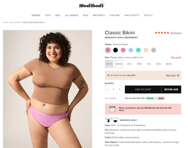
In this Modibodi example, a user can select between different colours without having to scroll. They have visibility on the colours and sizes available.
Another holiday UX tip to consider – having relevant cross-sells close by, to help reduce potential disappointment. It might sound obvious but giving users options at all times, does ultimately help keep them inspired and perhaps one step closer to conversion.
3. Speed up the purchase process with login and guest checkout
It’s essential that the checkout process is as smooth and frictionless as possible, not just for Easter Saturday but always (always!). Brands such as Decathlon and New Balance are hugely successful for a reason, and their checkout process is just one of many reasons why. It’s simple, intuitive, and easy to use.
Quite often, websites opt for over-complicated (multiple steps and unnecessarily long forms) checkout processes (not usually on purpose). One of my biggest recommendations when working with checkout funnels is to try and keep it as simple as possible (sounds obvious but think of your user). A user wants to checkout as quickly as possible, and options such as using social accounts help.
Once happy with their cart, start giving users the option to log in, register, or ‘checkout as guest’. For existing customers, they’ll probably want to login as their details will be completed already. We don’t want existing customers to fill out all these details again!
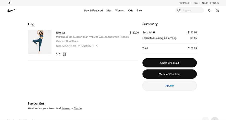
One of the best examples is Nike, which allows existing customers to login and new users to ‘Checkout as Guest’. By checking out as a guest, they’ll have the opportunity to create an account at the end of the journey.
Try to keep them focused on the task at hand by guiding them step by step. Remove distractions (avoiding extra links that take them out of the funnel) and gray out incomplete steps until they’ve finished on their current step.
There are still plenty of opportunities for retailers to come out on top this Easter. Brands can do worse than invest in optimising their websites for heavy traffic across mobile and desktop devices, testing their digital journeys and fixing any problems early to drive sales during this critical period.
Matt Christie is UX design strategist for EMEA & APAC at Contentsquare.