Australia’s largest made and owned paint company, Haymes Paint, has just released its latest colour library, ‘Energy Shifts’, focused on leaving the uncertainty of the past two years behind and making room for new chapters in life.
People are searching for ‘feel good colours’ and ways to utilise these colours to make spaces feel unique, according to Haymes Paint colour and concept manager, Wendy Rennie.
“This is the focus of all three palettes within our Energy Shifts forecast. In retail spaces, you should choose colours that feel fresh to elevate the shopping experience for the consumers. The colours you select are crucial in achieving this,” she told Retailbiz in a recent interview.
“The colours featured in the volume 16 forecast allow people to experience the positive impacts of colour in the spaces they are in, which goes far beyond simply the aesthetics.”
Rennie has studied the psychology of colour and applied colour psychology, finding it crucial that colours being used in spaces are chosen with consideration for the activity that is taking place within the space.
“This goes beyond generalisations, for example the statement ‘blue is calming’ is not necessarily a fact. Businesses need to plan the experience they endeavour to provide in that space, and carefully choose the colours in this space for the most successful outcome.”
Colours in the Carefully Nurtured palette can be used as a harmonious set of shades, according to Rennie. “They are calming and elicit positivity in the spaces they are used. All colours that are softer and less saturated offer a soothing and comforting ambience. These shades are uplifting and can be used without being too overwhelming.”
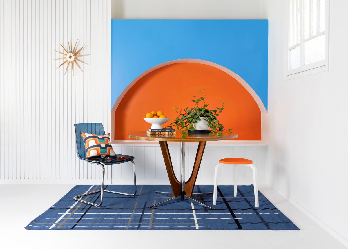
Colours in the Light Play palette possess an intensity and need to be used in spaces where there will be short bursts of interactions to guarantee that exposure to the colours act as an energy boost. “These colours add a different intensity to spaces.”
The fun and vibrancy of the colours from the Live Wire palette elicit a sense of curiosity and excitement. “These colours can prompt a positive effect in social settings. However, in a retail space it is important to consider how your workers would feel being surrounded by bright colours. I would suggest balancing colours for the most beneficial impact on workers and shoppers.”
Speaking to broader interior design trends, Rennie believes there is already an undeniable shift in the general consensus pertaining to the importance of colour in the design and architecture of interior spaces.
“Colours can have a negative impact if not used with careful consideration, for not only those that may come into the space as a consumer, but also those who work within the space. If colour is applied to spaces in a way that is profoundly thoughtful and considered, the space will be unique and the atmosphere positive,” she said.
“Essentially, what ‘looks good’ may not make those within the space feel good. This is ultimately how we should and will move forward when designing spaces; harnessing the power of colour to shift the ambiance within the space.”